How do you feel whenever you see a crumpled piece of cloth on someone, but sometimes you get to see the same fabric on the person, laundered and properly ironed? The same effect proper laundering has on a piece of cloth is similar to what home staging does.
Anytime you plan a home staging, you are set to dress the home in the most presentable form. Home staging gives your prospective buyer the perspective of the home and aids their decision-making process. A good home that is not correctly staged/presented will seem of lesser value than the properly staged one.
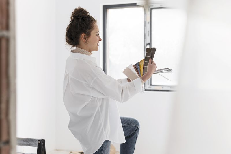
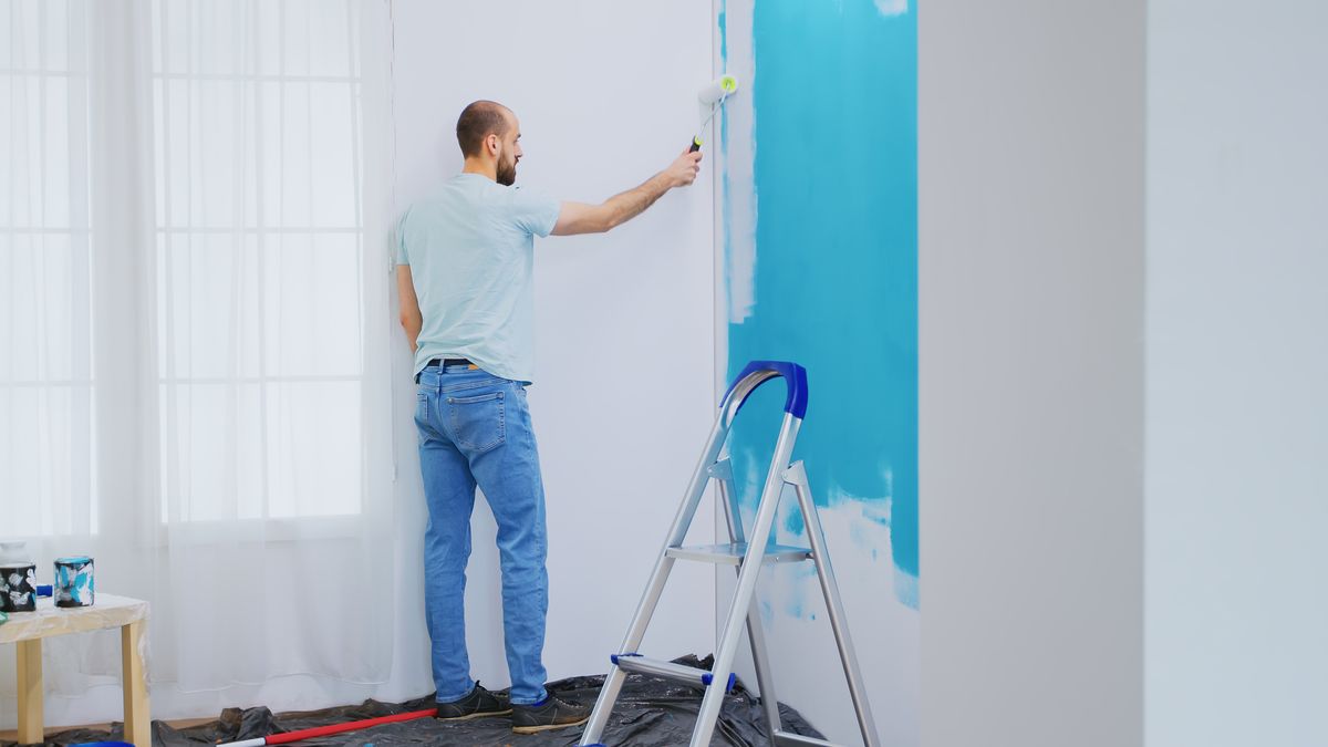
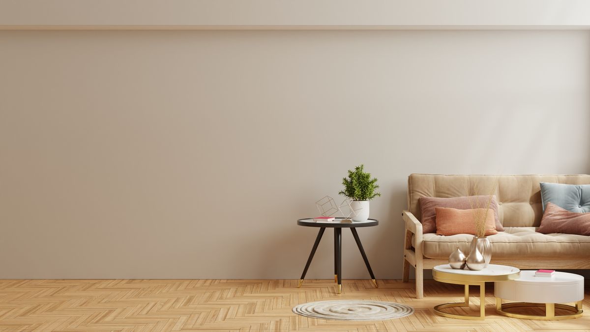
To create a good impression of the home, ensuring a top-notch look and feel of the space is very important. Choosing the best color for home staging is one of the tiny pieces that makes a home staging perfect. As professionals, we always recommend using white or off-white color.
However, if you have been concerned about getting a proper staging done, you are in the right place. This blog page will walk you through appropriate and irresistible home staging hacks. When planning to stage a home, many factors contribute to the success, which are the tiny pieces that make a whole.

Things You Should Consider When Choosing Color for Home Staging
For home staging, there are three significant factors: clean, clutter, and color. They are called the 3Cs of home staging. To choose your color for home staging, you should put three things into consideration:
- Furniture color
- Your decorative accent
- Wall color
These three aspects must possess complementary colors to achieve an aesthetically pleasing environment. Having understood the significant contributors to the color feel, you then use them in the right proportion to achieve the best look for your home. Some factors to consider when figuring out home staging colors are:
1. The Area of the house
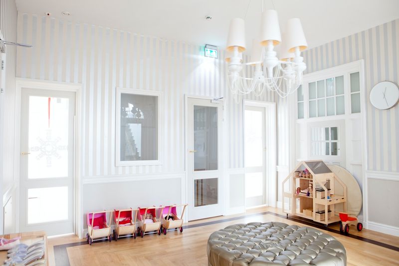
We recommend white for wall painting. However, depending on the theme you have chosen to work with, you should channel your energy to making the space feel like what you’ve envisioned. You can decide to tweak the design or the layers of paint.
 White is elegant, simple, and classy. It gives the home an elevated appearance and aids ventilation.
If your living room is painted green, it sends a different sensation to the buyer, and you do not want to give that first impression. The hack is that you can never go wrong with neutral colors.
2. Consider the ceiling
For somewhere with a vaulted ceiling that draws attention to the top, you should consider being highly minimal. The arch in the roof has enough prominence already, so using an equally pronounced color will make a mess. Similar to the wall colors, we recommend that you use white to ensure synergy between the wall and the ceiling. However, instead of going for a plain painting, you can add lines and patterns (also in white)
3. Furniture available
Ideally, you should avoid combining more than three colors when home staging. You can stick to color and use different shades or tints of it. The color of the furniture, decorative accent, and the color of the walls should harmonize. When colors align and complement each other, they speak nothing but class in the room. The careful use and arrangement of colors will compel your buyer to make a fair deal in no distant time.

4. Illumination
In choosing a color, the illumination of the space must be at the back of your mind. Questions like; how dark will it make the space look, how light will it make it look? Does it grant the Area the feel of purpose?
Remember that this is not solely dependent on color, but the color is a major contributing factor. The dicey thing about home staging is that you do not know the preference of the party you are staging for, but that should not hinder your setting. This takes us back to the use of neutral colors; they come through every time and everywhere.
5. Ventilation
Places like the kitchen need all the ventilation there can be; you don’t want to cook in an area that is poorly ventilated. Apart from the architectural design, the interior design can convince your buyer and make them believe they are opting for the best offer. In the case of inspection, they need to be as comfortable as possible, and the color can be a big plus. Colors like red, bright yellow, and green will make the room stuffy and choking.
How to choose the right color for home staging to Impress Buyers?
Don’t forget to always choose interior paint colors for home staging. That’s like the number one rule if you want to impress buyers.
1. Neutral Colors
Examples of neutral colors are pure white, a combination of gray with a beige undertone called Greige, classic gray, solid black, cool tan, and off-white, which some call eggshell. Also, you can explore different shades of neutral colors and other cool colors that fall into this category.

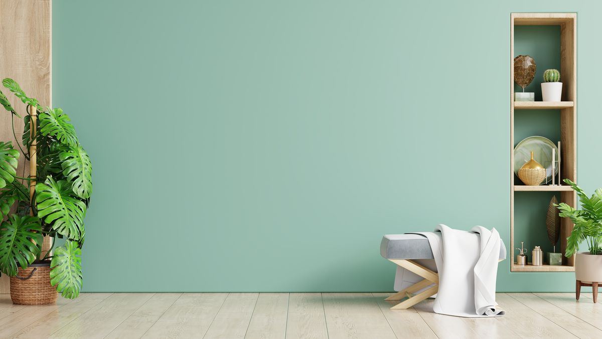
2. Green
Green is the most commonly associated with nature, making it an excellent color to use when selling a home. It looks fantastic when used with natural plants. We love staging a home with plants because it always makes a space feel more fresh and inviting.
This can be as large as a large plant pot (real or fake) by the front door, in a room corner, or as small as a palm frond in a vase on the kitchen counter. Any small amount of green added in this way can be combined with other colors and always positively impacts the overall atmosphere of a home. If you’re bringing it in with decorative accents different from plants, we recommend a very light tint of green.
4. Light Blue
Light blue is our favorite color for home staging because it is invariably refreshing and relaxing. People associate blue with the sky and the ocean, which elicit a calming response; it brings life to a space without dominating it and always looks graceful, even in a more casual setting, when applied in combination with neutrals. A soft blue also evokes feelings of trust and dependability, which are ideal for buyers to experience while touring a home.
5. Brown
Brown provides the room with the feel of nature and warmth. It is very suitable for both interior and exterior staging because it conveniently complements black and white. There are different shades of brown, some of them are Coffee, Mocha, Cedar, Tawny, and many others. The color brown goes well with bohemian accents because they are free-spirited. It could be an area rug, leather chair, or layers of fabric.
6. Yellow
Yellow is the brightest color in the rainbow. So it’s ideal for a gray palette, which is popular today. It stands out against the gray and creates a perfect, modern look. To tie it all together, place yellow cushions on a gray sofa and hang a piece of yellow artwork, such as a flower.
Choose Paint Color for Home Staging: Which Colors Should You Avoid in Home Staging?
1. Red
Red is a beautiful, powerful color to use in home decorating, but because it attracts so much attention, it can overwhelm home buyers. Home staging aims to enhance rather than detract from the home.
Unfortunately, because red is such an eye-catching color, it can divert buyers’ attention away from what they should be looking at: the home itself.
The only exception would be a slight red accent or if there is a red element in the house that you cannot remove, such as a red kitchen, in which case you would want to accent it with a few red (but very contemporary) accessories.
2. Neon Shades
Most home buyers are turned off by highly bold, bright colors because they prefer a relaxing atmosphere rather than an energetic one. So while neon colors can be exciting to decorate with, they are best saved for your next home.
3. Pink (conditional)
While we adore the look of pink in home design, it is unfortunately too feminine for the tastes of the majority of home buyers. However, it could be used for a female setting, to depict a teenage girl’s room. But with the consciousness that home staging aims to appeal to as many buyers as possible, it should be avoided in general spaces to make it gender-neutral.
While pink can be a fantastic color to decorate with, it has a distinct look that can turn off many buyers who can’t relate to the vibe or are distracted by it.

4. Pastels
Light colors (especially light blue) are good choices for home staging, but going for too soft a color palette is too specific a taste to appeal to many buyers. Just as too many bright colors would be a wrong choice for home staging, so would the opposite end of the spectrum. Again, you want to make the home visually appealing and complement it without drawing so much attention that buyers can’t see past it.
5. Purple
Purple, like pink, is a stunning color traditionally associated with femininity, though it can be skewed in a more masculine direction with the correct decor. However, sticking to the basics with no bias and error when selling a home is best.
Conclusion
Color is a significant contributor to the look and feel of the room. However, there are some colors you should not paint your home, especially when preparing for home staging. If you are planning a home staging, your ultimate goal is to make the home look the best it can ever be.